Create and share ideas in a way that is seamless and simply splendid.
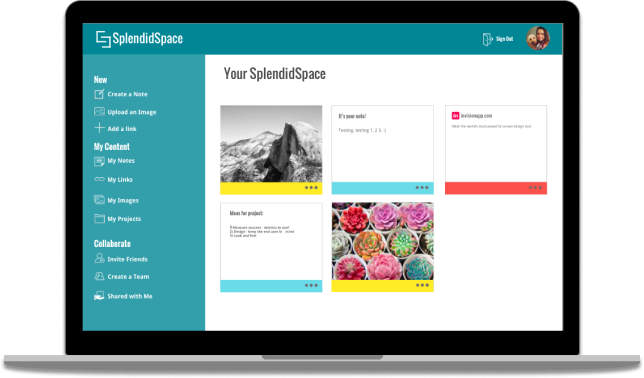
Presenting SplendidSpace
SplendidSpace is a web and mobile application that allows users to easily create written notes, save images and links and share content with friends and colleagues. SplendidSpace enhances the sharing aspect of cloud storage, allowing users to create teams to quickly build and share products. SplendidSpace makes organization and collaboration simple and fun. For this project, I took on the design from start to finish. I utilized Sketch for most of the work, including wireframes and in conjunction with Invision for my final clickable prototype.
View Prototype
THE PROBLEM
There are various products on the market that promise to boost our productivity and make us more efficient. Google Drive and OneNote for example, each provide note taking and sharing services that while advertising convenience and productivity, often fall short for users, lacking the consistency and collaboration technology that is often desired. For this particular project, the sharing aspect was an important feature to include, alongside creating and organizing content.
THE SOLUTION
SplendidSpace is a working solution to common cloud storage frustrations. SplendidSpace is a web and mobile application that allows users to easily create written notes, save images and links and share this content with friends and colleagues. SplendidSpace also enhances the sharing aspect of cloud storage, by allowing users to create teams to quickly build and share products. SplendidSpace makes organization and collaboration simple and fun.
THE RESEARCH
Surveys
Surveys
I began my research with a survey of current users of cloud storage products. I wanted to understand the habits and trends of my perspective users.
The Good
- Easy to use
- Can be accessed from any device
- real-time collaboration
The Bad
- Privacy Concerns
- Haven't mastered collaboration
- Google sheets is not as good as excel
Key Findings
Collaboration and sharing content with friends and coworkers is important for users, which they find to be difficult at times when utilizing current applications. Understanding this primary use of cloud storage, it was clear that SplendidSpace would need to be compatible on multiple devices to ensure that content is easily accessible and shareable.
THE PEOPLE
After interviewing those that participated in my survey, I found that I have a couple different types of users, between the ages of 23 - 35. The average user mainly uses cloud storage for work or school purposes and will occasionally share photos or links with friends and family outside of work life.

Amy, 25 years old
Account Manager, Seattle, WA
Motivations
Amy uses Google Drive and Dropbox at work. She shares spreadsheets and other projects with her co-workers. She appreciates the ability to easily access her files from work, home or elsewhere. Amy enjoys the collaboration capabilities of Google Drive and leverages it for group projects. She doesn’t use cloud storage much beyond work. She will occassionally share photos with friends using Google Drive or save a new recipe on Pintrest. She prefers to use products that are free to no cost.
Frustrations
Google Drive doesn’t always have the same capabilities as Microsoft Office, and sometimes privacy can be an issue - she wants to ensure her content is safe.
“At work, I share files and collaborate with collegues.”

Bryce, 31 years old
Law Student, Los Angeles, CA
Motivations
Bryce often uses cloud storage when doing group projects in class. He likes to use Google Drive to easily access files from others students and collaborate on shared work. Bryce appreciates Google Drive because it is doesn’t cost a thing, and he is able to keep excel files, presentations, documents, and pictures all in one convient location.
Frustrations
His only hesitation is security when it comes to saving items to the cloud. Bryce doesn’t use drop box because he can’t use it to collaborate very well. He doesn’t feel like dropbox has mastered this capability.
“Google Drive is my jam - it’s the best for my studies.”
THE OTHER GUYS

There are plenty of competitors currently in the cloud storage market. I researched their strengths, weaknesses, opportunities, and threats to determine how SplendidSpace could provide the most value to users. Every application has it’s pros and cons. For example, while Dropbox is a popular tool on the market to save and share content, users tend to be most frustrated that Dropbox has yet to completely nail the collaboration aspect of the product. Google Drive’s real time collaboration makes it ideal for group projects, but it can get a bit cluttered with all of the apps and types of projects that can be created. Finally, Pintrest has its own corner of the market as it is a unique product primarily used “just for fun” and less for work or school purposes. I learned through this analysis of major competitors what I wanted to focus upon for my own app - a simple product that is dedicated to collaboration, and while professional, has a youthful and energetic vibe that differs from the rest of the market.
THE ARCHITECTURE
USER STORIES
My next step was to create user stories that would inevitably be essential in the creation of my minimum viable product. The list below helped me to create my user flows in order to help visualize how a user would complete various tasks. My high priority user stories are as follows:
- I want to create an account using Facebook
- I want to create an account using my email and password
- I want to upload a picture
- I want to save a link
- I want to create a note
- I want to create a project
- I want to create a team
- I want to add friends using Facebook
- I want to add friends using email
- I want to sign out of my account
- I want to view content that has been shared with me
USER FLOWS AND SITE MAP
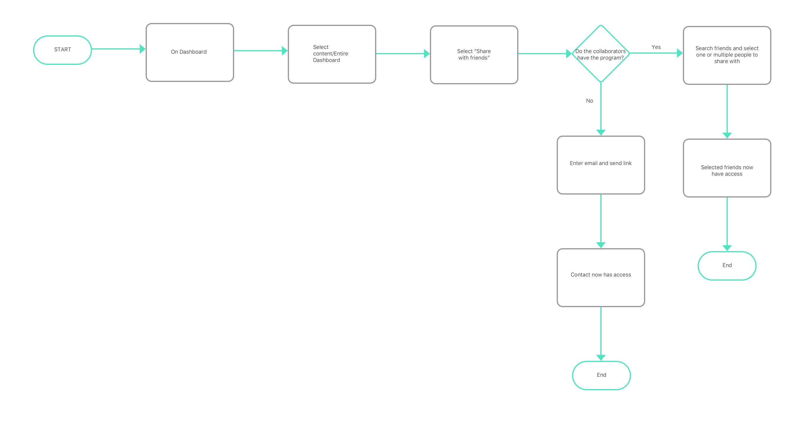
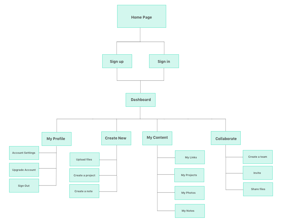
The user stories were useful in creating my user flows. I wanted to be able to visualize how a user would use SplendidSpace. I built flows that would be important to my MVP. This included the onboarding process for new and returning users, adding friends, saving links and uploading photos. My user flows helped me to create my site map, where I was able to create a web of the flow of someone moving from page to page on the site.
THE BRAND AND DESIGN
The inspiration for SplendidSpace is simplicity and efficiency with a playful and energetic spirit. The SplendidSpace Style Guide contains a deep dive into the branding for SplendidSpace.
LOGO
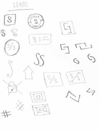
The logo for SplendidSpace is simple and easy to recall. The abstract “S” shape also coincides with the name of the brand.

COLOR AND TYPOGRAPHY
The color palette that includes bright and fun accent colors to help create a tone that is both playful and energetic.
- Teal
- HEX #008695
- RGB 0 / 134 / 139
- Dark Coral
- HEX #FD524B
- RGB 253 / 82 / 75
- Sunny Yellow
- HEX #FFEB26
- RGB 255 / 235 / 38
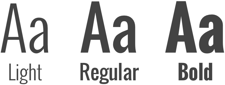
Oswald is the title font used for headlines. It may be used in Regular, light or Bold weight.
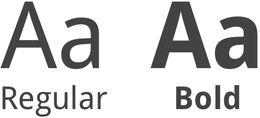
Droid Sans is the secondary typeface, mainly utilized for subtitles and body text. This type may be used in Regular or Bold weight.
WIREFRAMES
After grasping an understanding of what tasks would need to be included in the final product, I created my wireframes to test the functionality of SplendidSpace. At first, these were rough hand drawn sketches that eventually developed into wireframes built using Sketch.
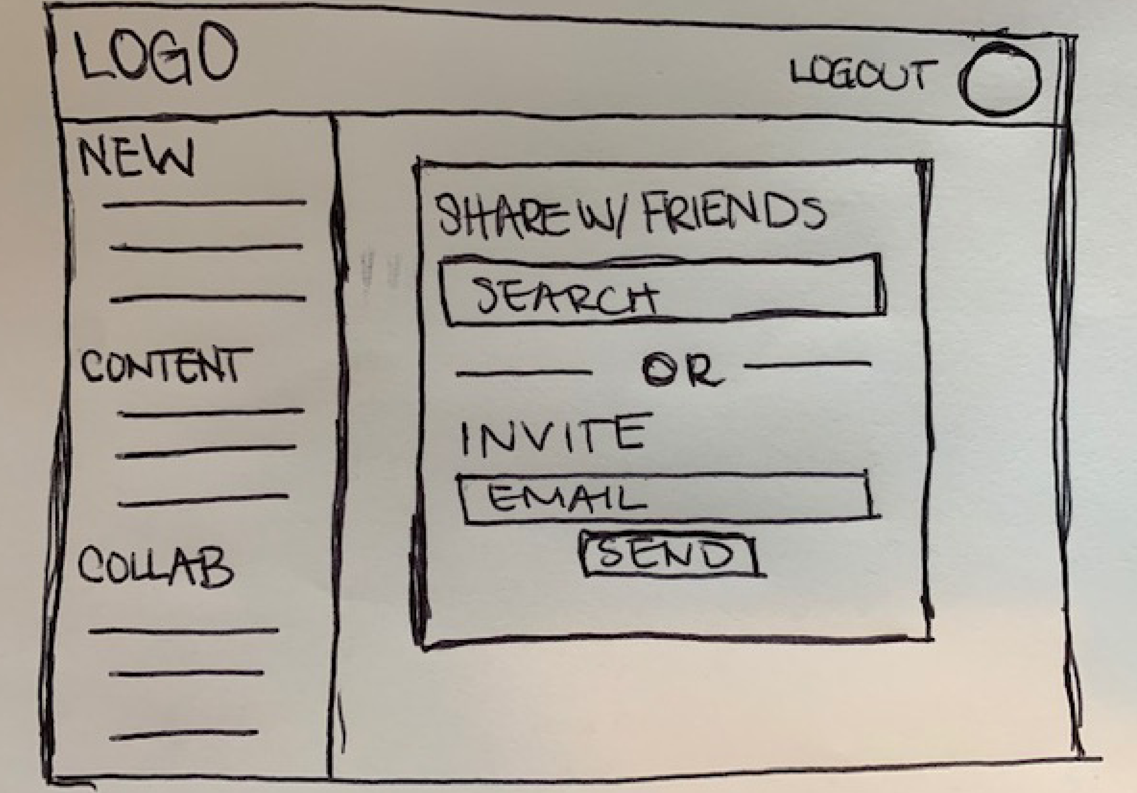
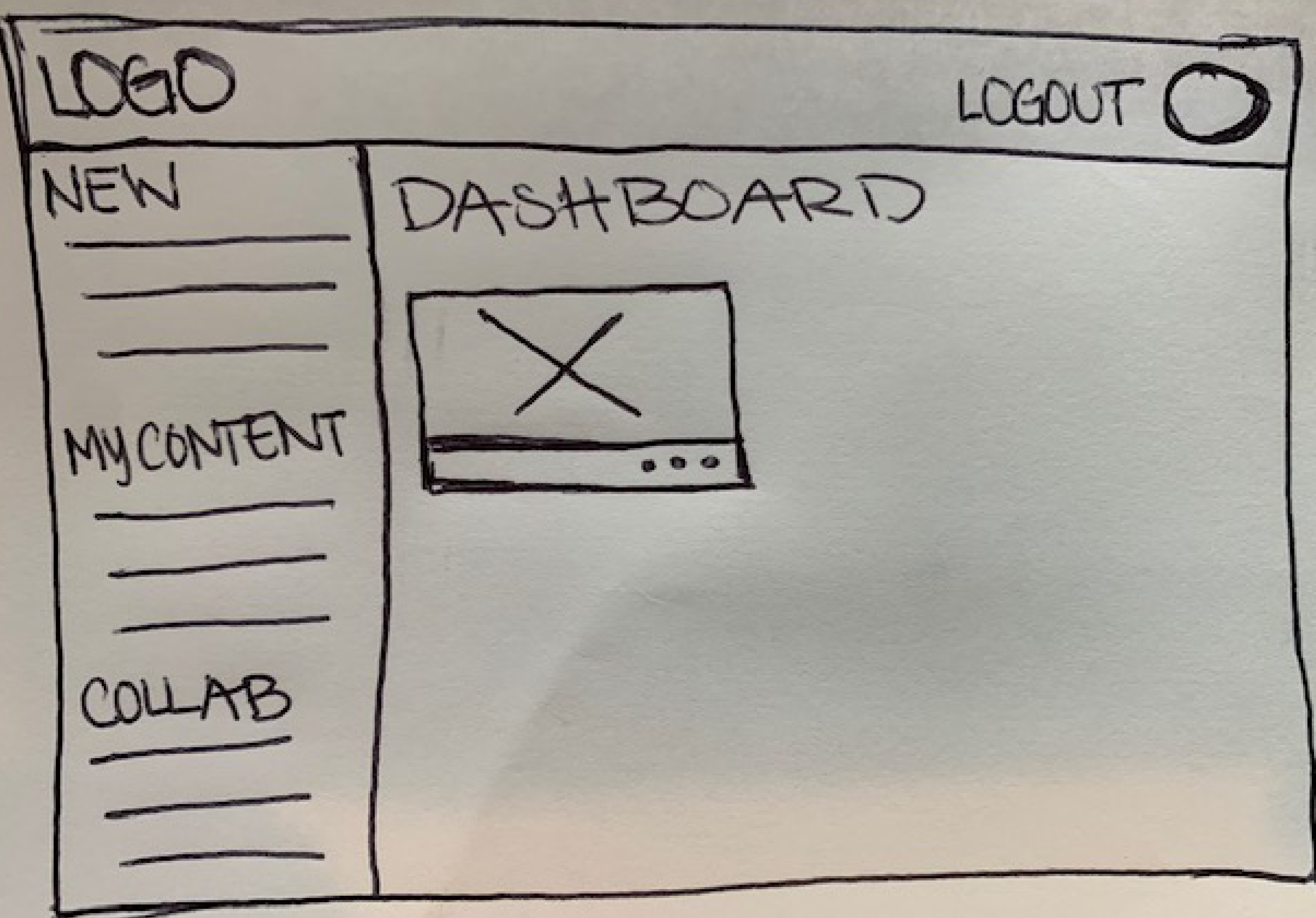
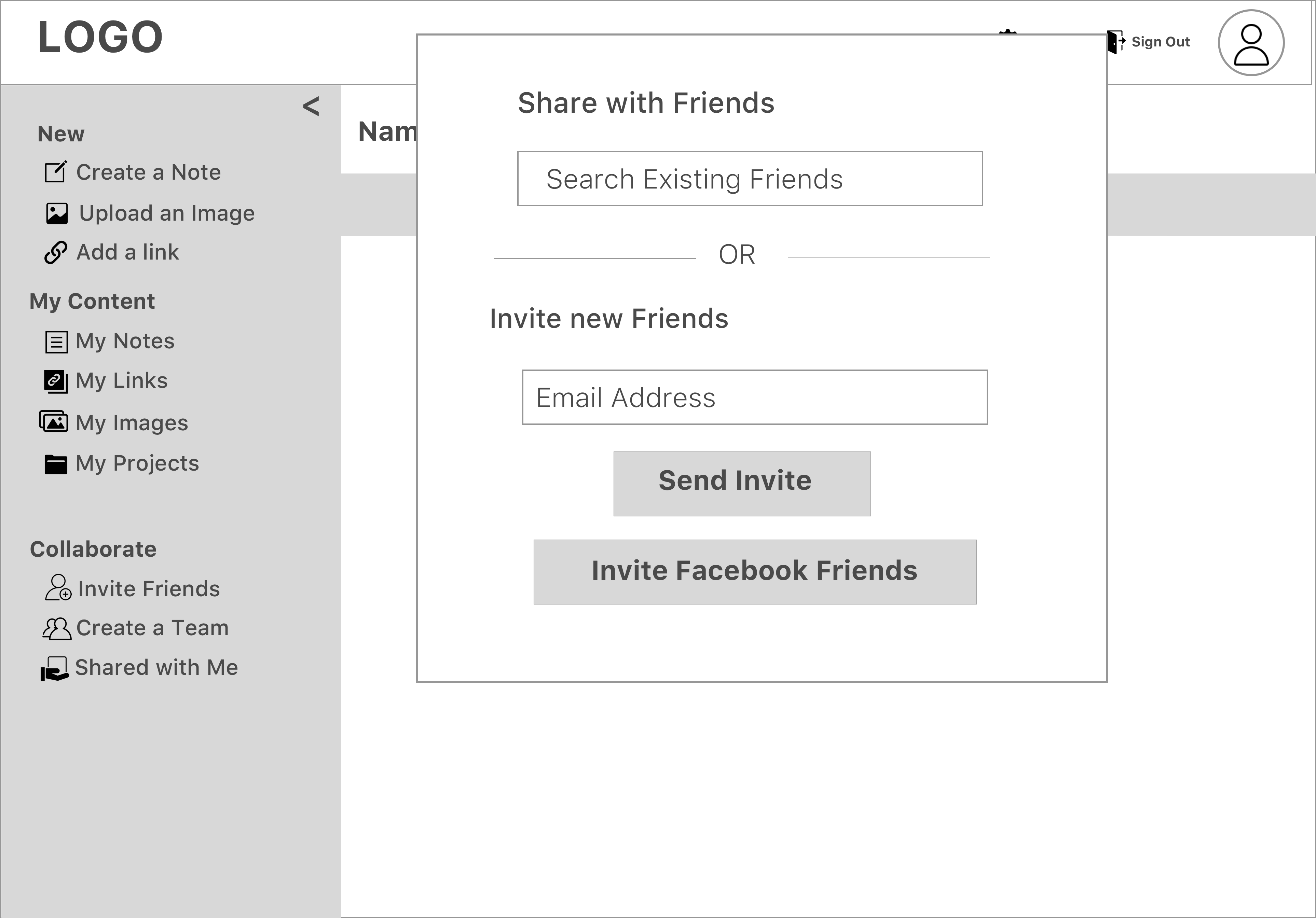
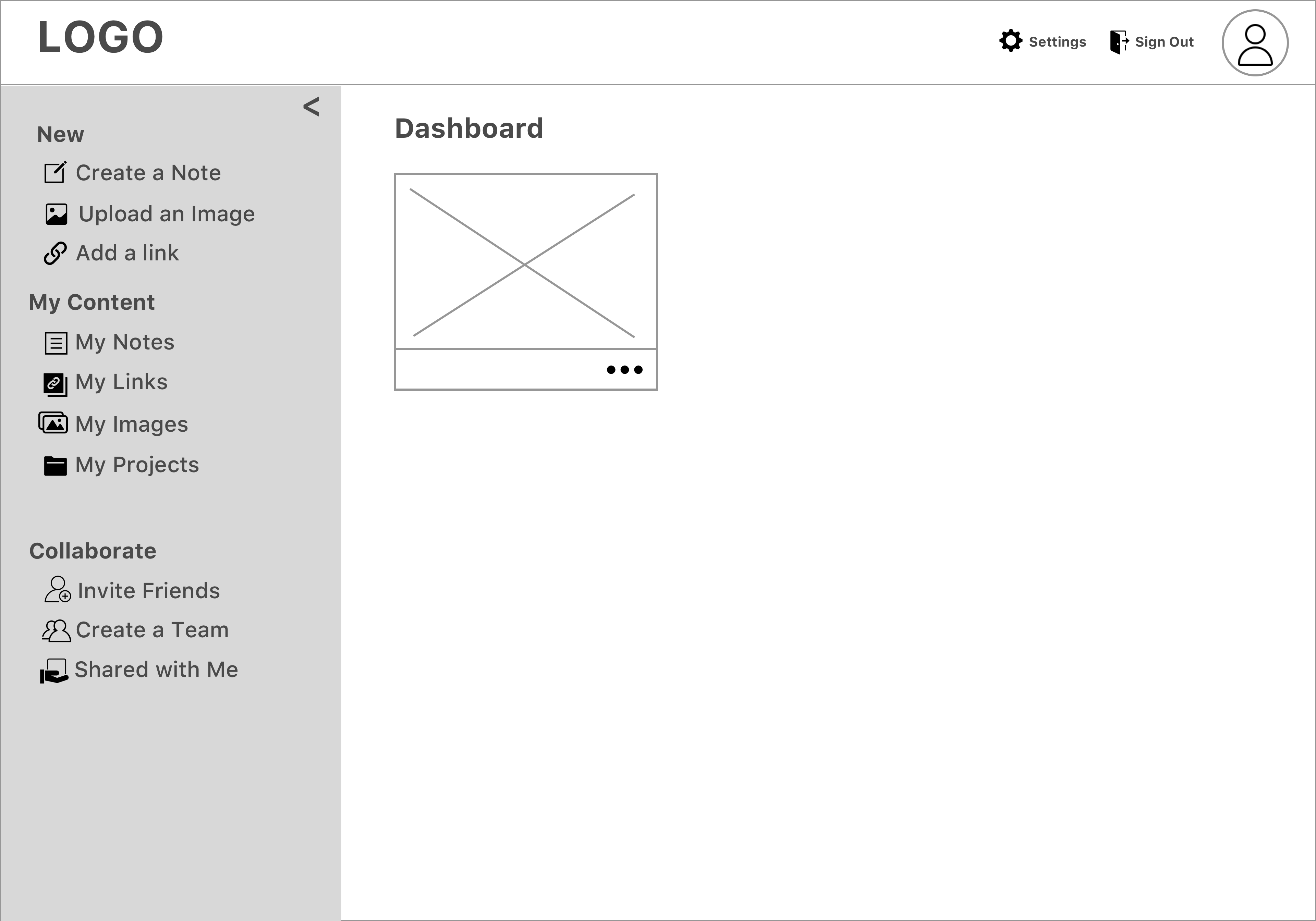
The Sketch wireframes helped me to test the tasks that I knew would need to be completed for my MVP. I found flaws and various aspects of the app would that would need editing through the feedback I received. I used Invision for this segment of the design process.
THE USER TESTING
I next transformed my wireframes into a high fidelity prototype. After finishing this test, I completed additional testing using Usability Hub in order to understand which iterations of my design were most compelling for users. Finally, I completed my clickable prototype, where I was able to view 3 additional people use the product. This last test helped me to make some last minute changes to the design. For example, I decided to do away with the “settings” icon, as most users were accustomed to clicking on a profile picture to complete this step.
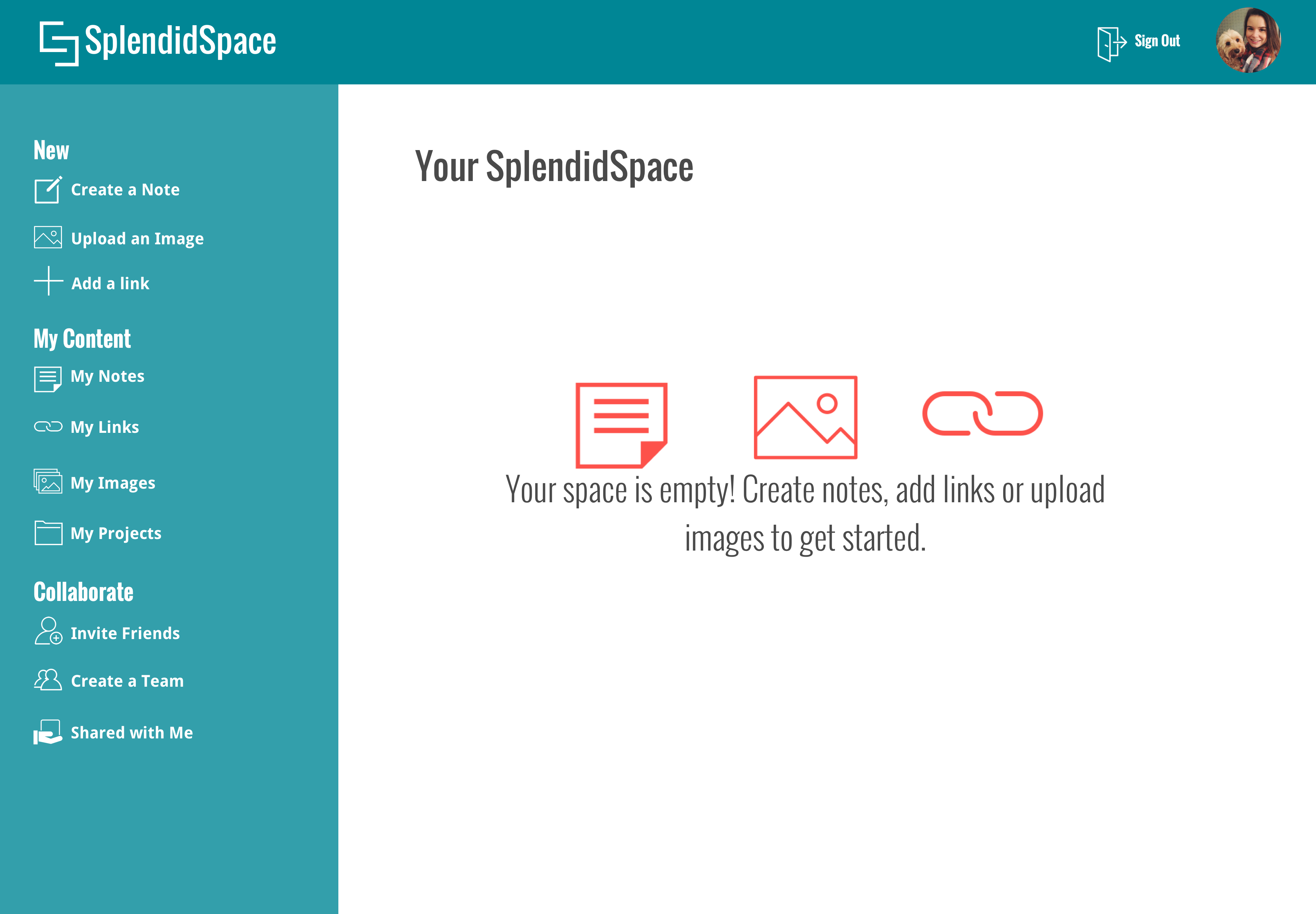
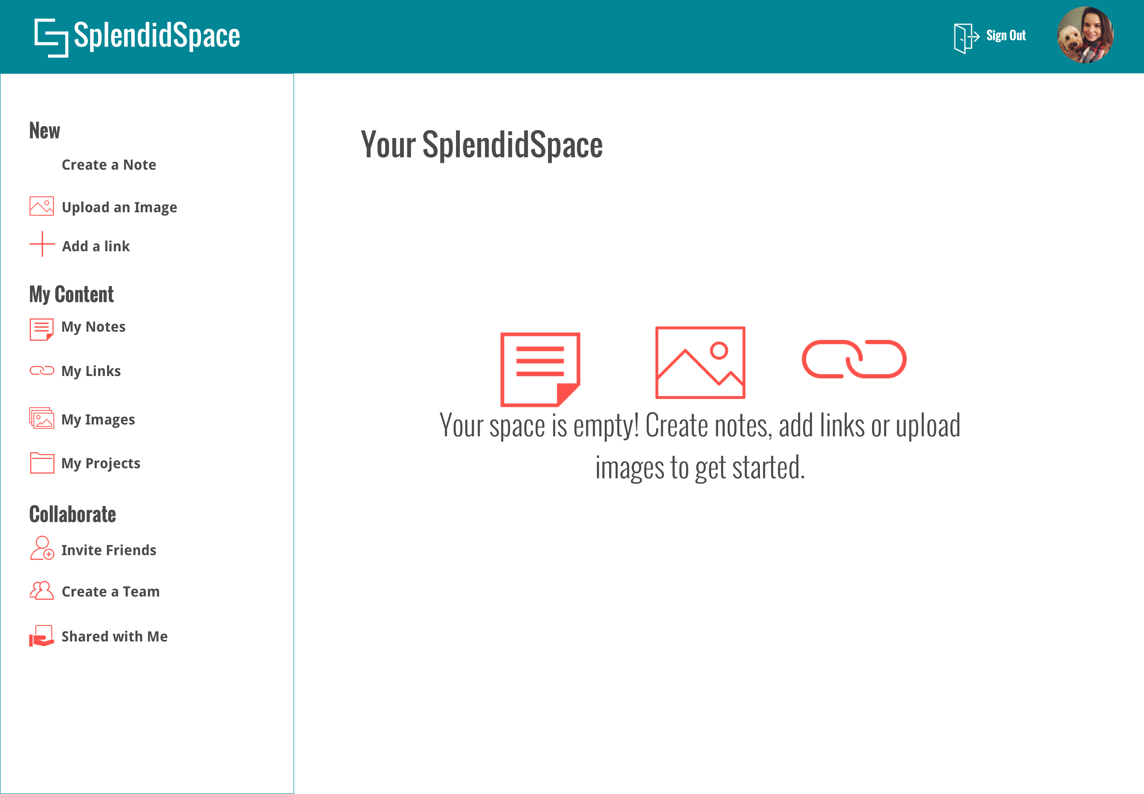
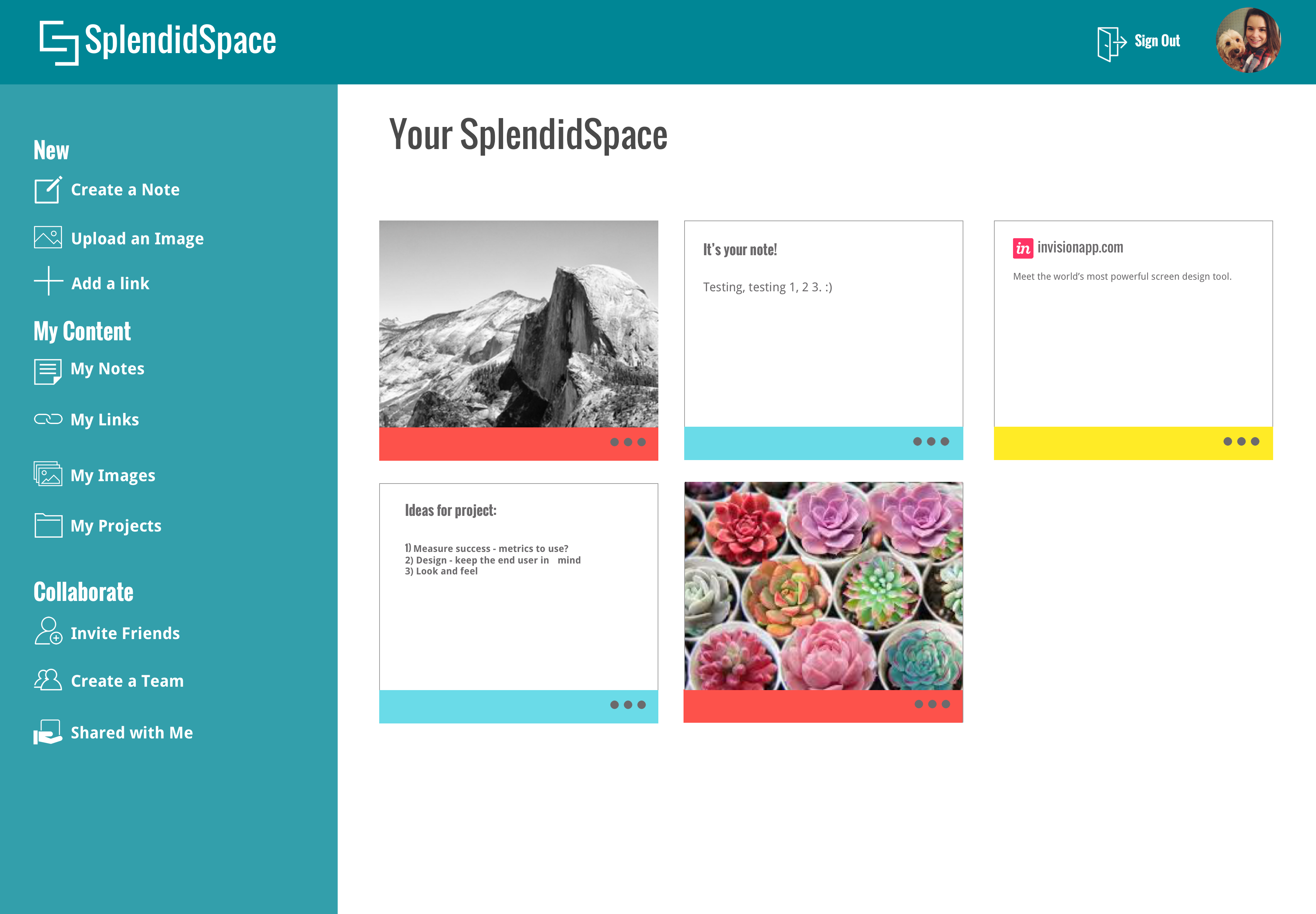
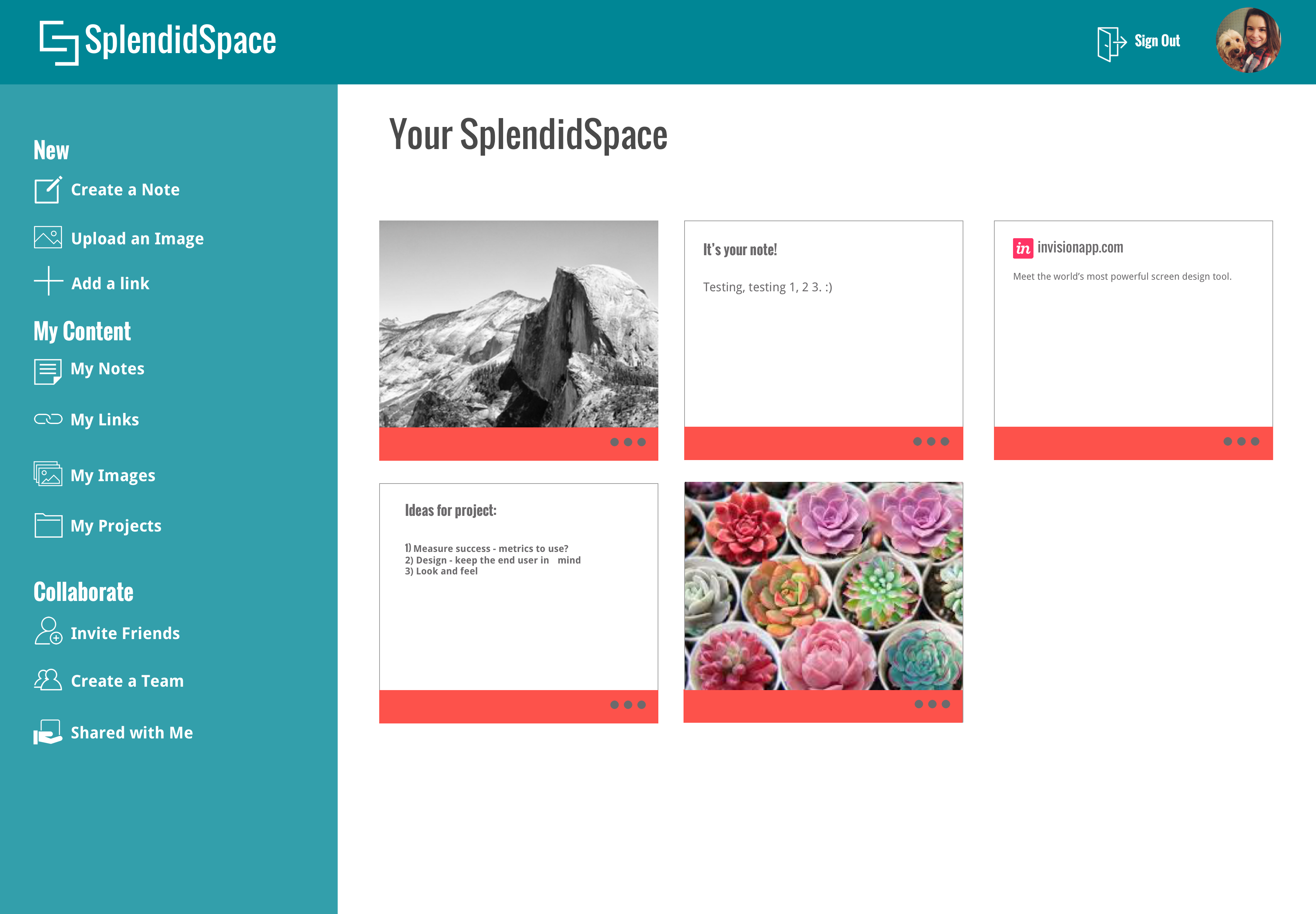
After completing the preference test on the above designs, found that 75% of those I tested prefered the blue menu bar, and the colored tabs vs. the coral tabs were 15% more popuar amoung my testers.
WHAT I LEARNED
Using my research, I created a final product that helps meet the needs of the client and the end user. SplendidSpace is a simple tool, and provides the user the ability to better collaborate on mobile and desktop devices - creating a seamless experience when working on projects with colleagues. Those that used the app appreciated the simple design, and were able to click through easily when asked to complete certain tasks.
As with any project, I inevitably experienced some challenges along the way. This was my first time ever creating an app. It was amazing and quite insightful to understand the amount of time and energy that it takes to create each page and to design a flow that is cohesive and makes sense to the user. It took what seemed like an eternity to create my original wireframes! If I had additional time, or more freedom in the project, I would have liked to create a product that is more unique - an idea that I had was something similar to “Hootsuite” but for cloud storage apps. I learned that while the mind of a designer may have a multitude of ideas of what could be the “best” design or formatting for an application, the stakeholders and users are the most important. It is vital to do research and test multiple times in order to really hone in on the perspective of the end user, and they may be different than your own, as well as check back on your original objectives as to not lose sight of what your client desires in the end product.
View Prototype